Terra Design System: AI-powered Apps for Enterprise Business
Streamlining design: reducing technical debt, aligning teams, and delivering better products with a unified language
TL;DR
“I saw the symptoms of design debt creeping in and turned them into a strategy for speed and scale, reducing implementation time by 50%.”
- The problem: Rapidly scaling, AI-focused enterprise apps were shipping without a shared design language, causing rework, inefficient handoffs, and fractured customer experiences across sectors.
- My role: Led the design system initiative, driving research, component design, documentation, and alignment between product, UX, and engineering teams.
- The solution: Delivered a modular component library, governance model, and standards for complex enterprise patterns, including AI annotation workflows and data-dense UI conventions.
- The outcome: Reduced design and technical debt, accelerated delivery across industries, and established a flexible system ready for future platform evolution.
When inconsistency becomes costly: The slow bleed of design and technical debt
In building an experience team for a nascent startup building an AI-based platform for enterprise apps, I faced a variety of challenges. Among the challenges: a lack of UX standards and consistent application, issues with iteration speed and progress, development hand-off issues — all resulting in high costs and inefficiency for development downstream. The solutions implementation team was struggling with these inefficiencies as the company grew, leading to significant challenges in maintaining consistent design across various products. The lack of a centralized system for UX patterns resulted in duplicated efforts and wasted time, as designers repeatedly created similar components without a unified approach. As well, platform clients were designing their own patterns without guidelines, contributing more chaos and redundancy. A lack of governance not only increased workload but also led to a disjointed user experience, where similar functionalities were expressed differently across various solutions, causing confusion for users and diminishing the overall effectiveness of the final products.
The challenge: Scale faster, smarter, and without debt
- Enable the platform to rapidly deploy apps with reusable components
- Save money, time, effort in design and development
- Reduce potential design and technical debt
- Create mechanisms for collecting tribal knowledge to train the AI
- Design componentry with a future vision of automated UX in mind
Our audience: Developers, designers, and the sectors they power
- Internal and client platform developers
- Internal and client UX designers
Target industries:
- Utilities
- Energy
- Healthcare
- Procurement Sector
My role: driving strategy while working hands-on
Creative direction, hands-on UX and interaction design
My approach: shaping a system built for today—and what was yet to come
I set out with some strategies to facilitate a shift in how the experience worked and delivered design to the organization. By establishing a unified design language, and taking a different approach to our work, the team would be able to streamline the design process, improve reusability, and reduce costs while ensuring consistency and scalability across the platform. The focus would be on creating a system that could rapidly meet the unique demands of the types of enterprise applications we were working on, and being able to adapt to evolving scenarios in the future.
To achieve this, we planned to:
- Align our teams: Bring UX and development teams together around a shared design language and set of principles to guide decision-making and collaboration.
- Design for scale: Develop a component-based design system that breaks down complex UI patterns into standard reusable elements, such as cards, buttons, forms, grids, and typography, ensuring modularity and consistency.
- Prioritize enterprise situations: Curate reusable patterns tailored to enterprise scenarios, such as managing large datasets, tabular information, pagination, and AI-driven search capabilities.
- Create guidelines and standards: Establish a comprehensive style guide and pattern library to clearly communicate the system’s rules and standards to all stakeholders, including designers, developers, and product managers.
- Plan for functional and platform flexibility: Ensure the system was adaptive enough to be implemented across various platforms (mobile, web, and iPad) and versatile enough to accommodate different client needs as they emerged.
- Have it ready quickly: given the frantic pace of ongoing projects and the genesis of new ones, we needed to very quickly have some standard in place and continuously build on it. Like a spoken language, we needed to use it now, but understand that it would always be changing.
Looking ahead, we also identified critical areas to focus on:
- Governance and maintenance: Implement version control and create robust documentation to make the system easy to adopt and scale. Regular review sessions and curated additions to the system would prevent redundant or conflicting designs.
- Collaboration and ownership: Foster a collaborative environment where multiple designers could contribute to the system, with clear ownership and responsibilities. This included regular feedback cycles and frequent communication to ensure we weren’t wasting time with duplicate efforts.
- Future-proofing: (or at least future-anticipating) We would need to anticipate undefined or abstract use cases, ideating patterns that could evolve with the platform’s needs. While designing for the uncharted realm of AI, there weren’t exactly comparable references elsewhere to look at, we had to imagine how our product might be used in innovative ways and push the limits of our thinking.
These strategies would enable us to navigate the challenges of rapid platform growth, support diverse enterprise needs, and build a design language that is both practical and forward-thinking.
Solution: A living system, from basic standards to future AI training
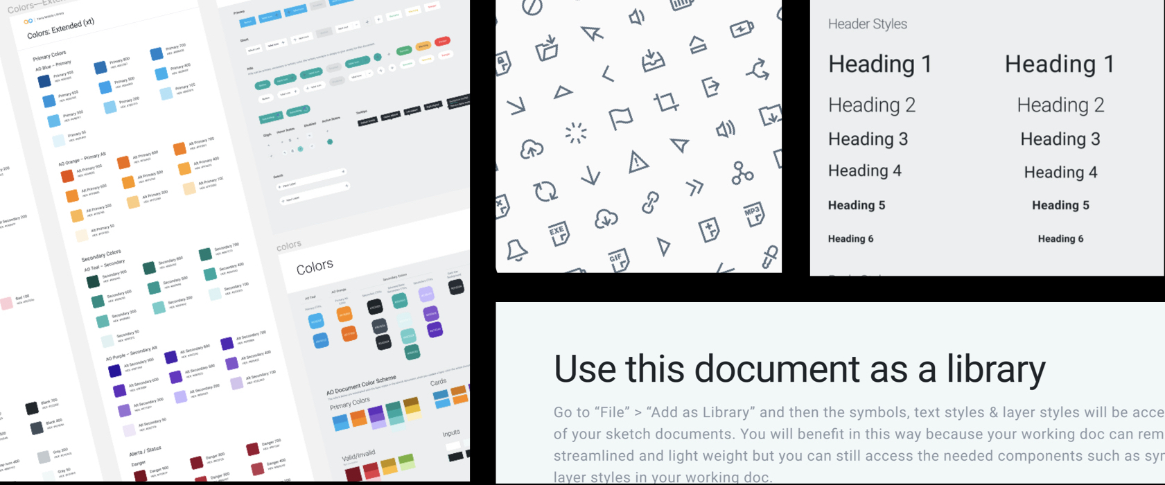
As a foundational source of truth, we documented basic and flexible UI standards
Basic UI elements and general usage guidelines were defined to ensure executional consistency. The system was created as intentionally basic and flexible - to be skinned and re-imagined for different client branding and style needs.
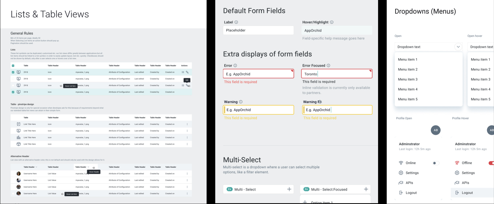
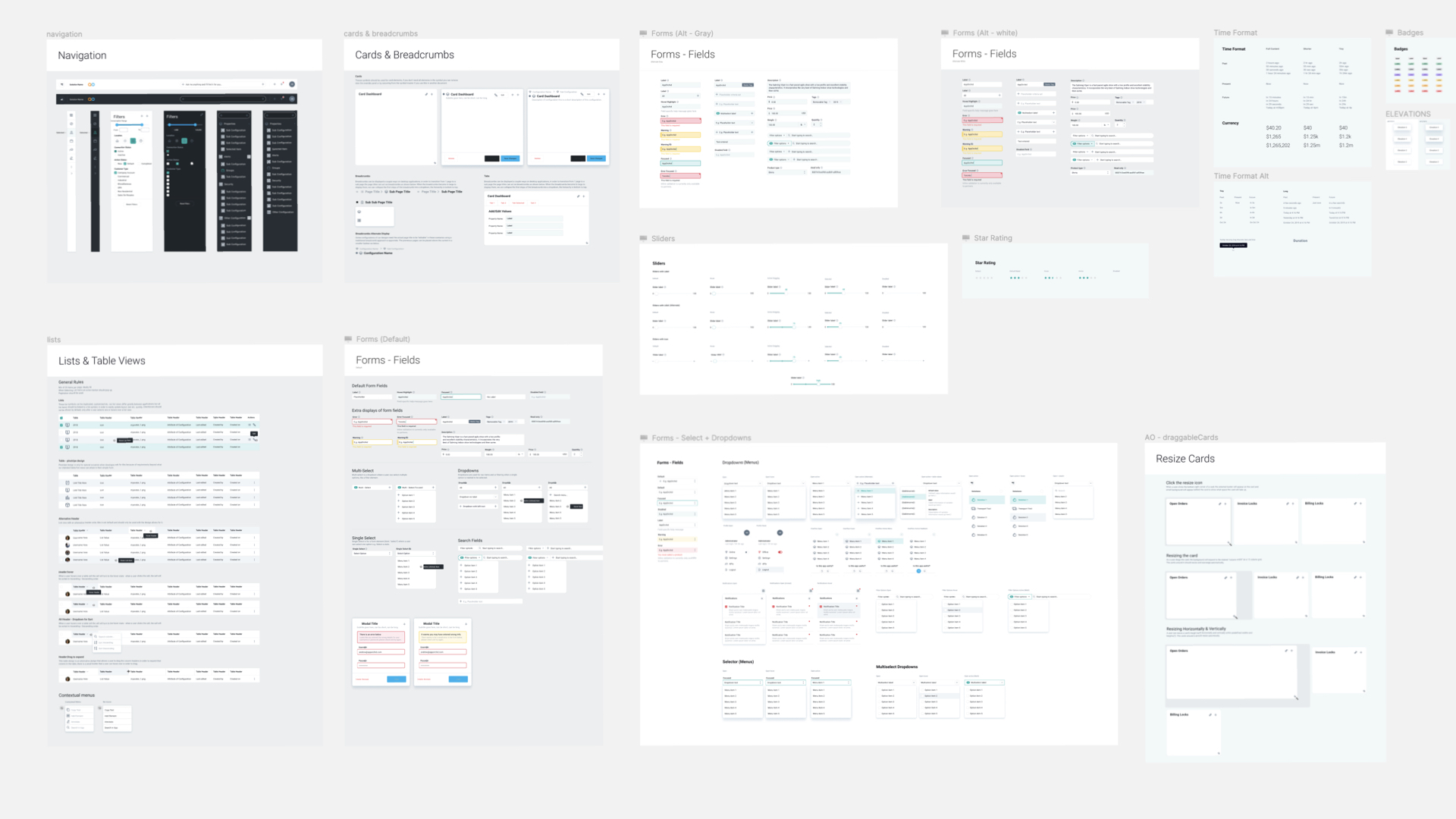
Create efficiency and cost savings downstream with reusability
A library of common reusable components and repeatable patterns used in our solutions were documented — ranging from simple functionality to advanced multi-part components. With this, we were able to expedite the design process, efficiently reuse components, and effect cost savings downstream.
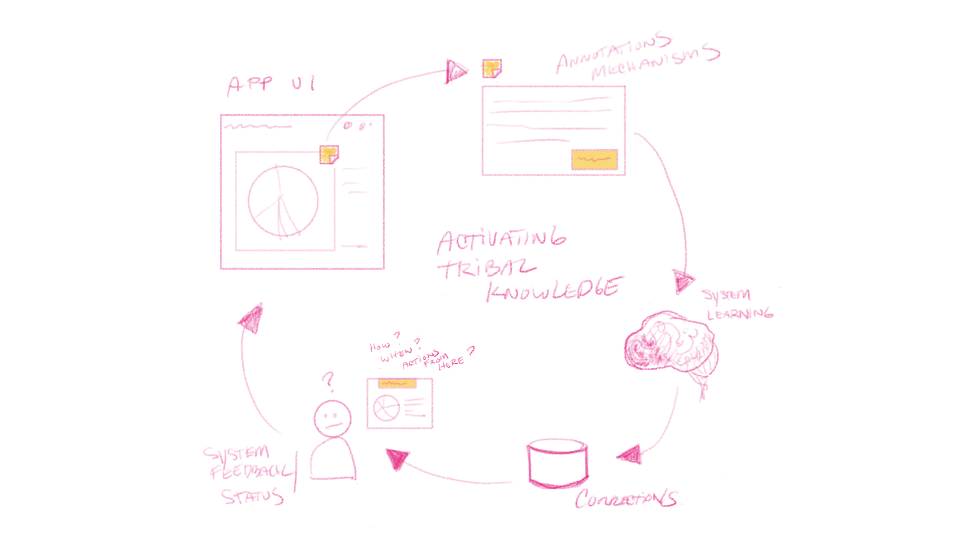
The platform required unique UI patterns for capturing tribal knowledge
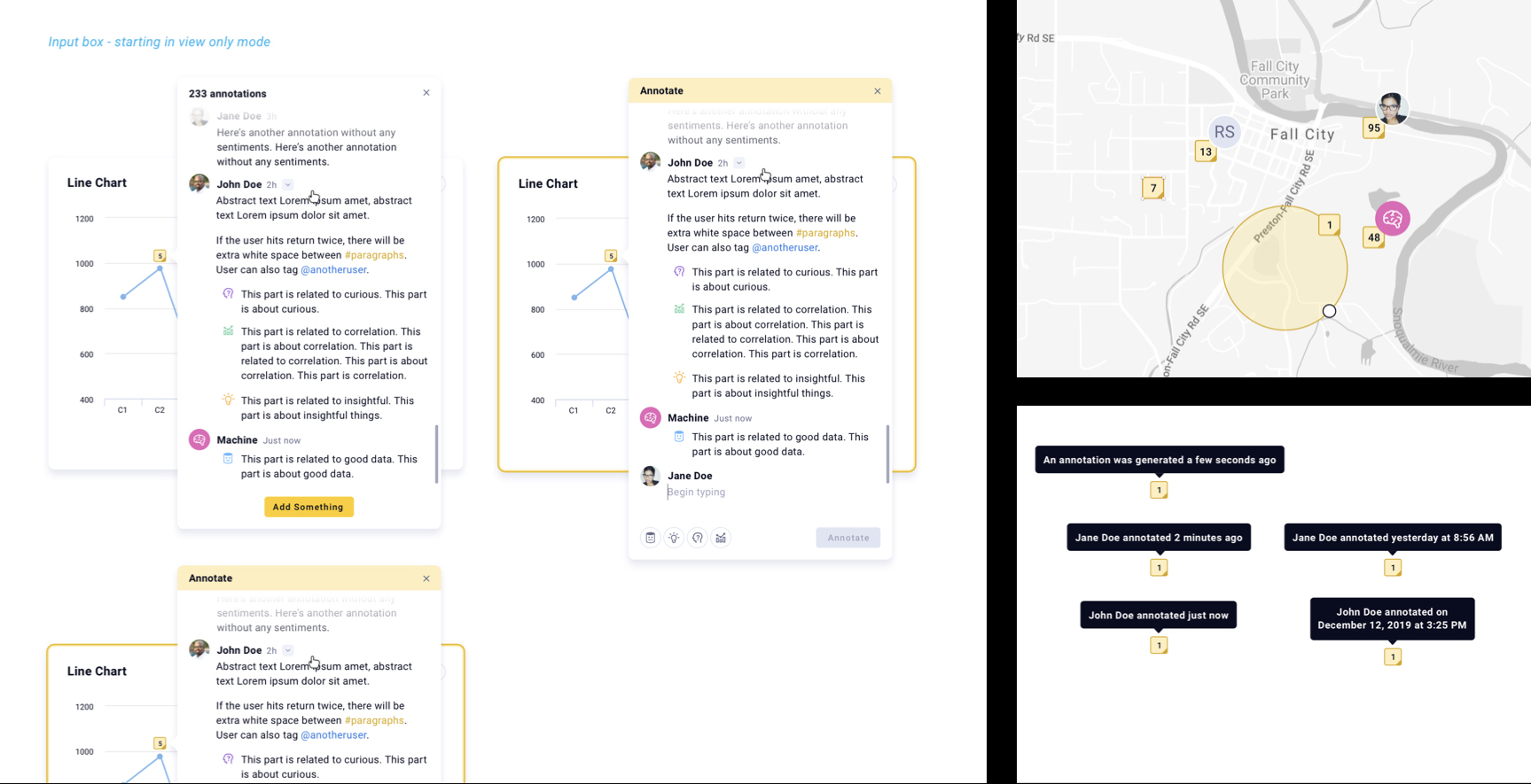
A core feature of the app platform was to provide provisions for users creating annotations to collect and activate institutional employee (tribal) knowledge. This data is used to improve and train machine learning models, and provide more accurate correlative and predictive capabilities. This presented a unique and ambiguous challenge in anticipating how and when this might theoretically be used, and what types of information needed to be expressed.
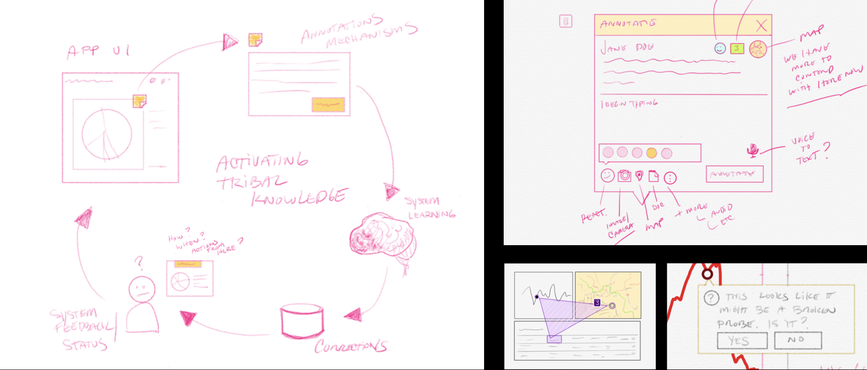
Expeditious techniques and processes were adopted for rapid ideation and exploration
For the unique tribal knowledge capture functionality, rough sketches with a digital drawing tool were used for early explorations and for providing initial creative direction. I was able to quickly flesh out ideas and validate them with leadership early, before executing high fidelity design. At times, these sketches were even used to produce rough interactive prototypes. These techniques continued to be used on a regular basis in working with stakeholders for solution implementations.
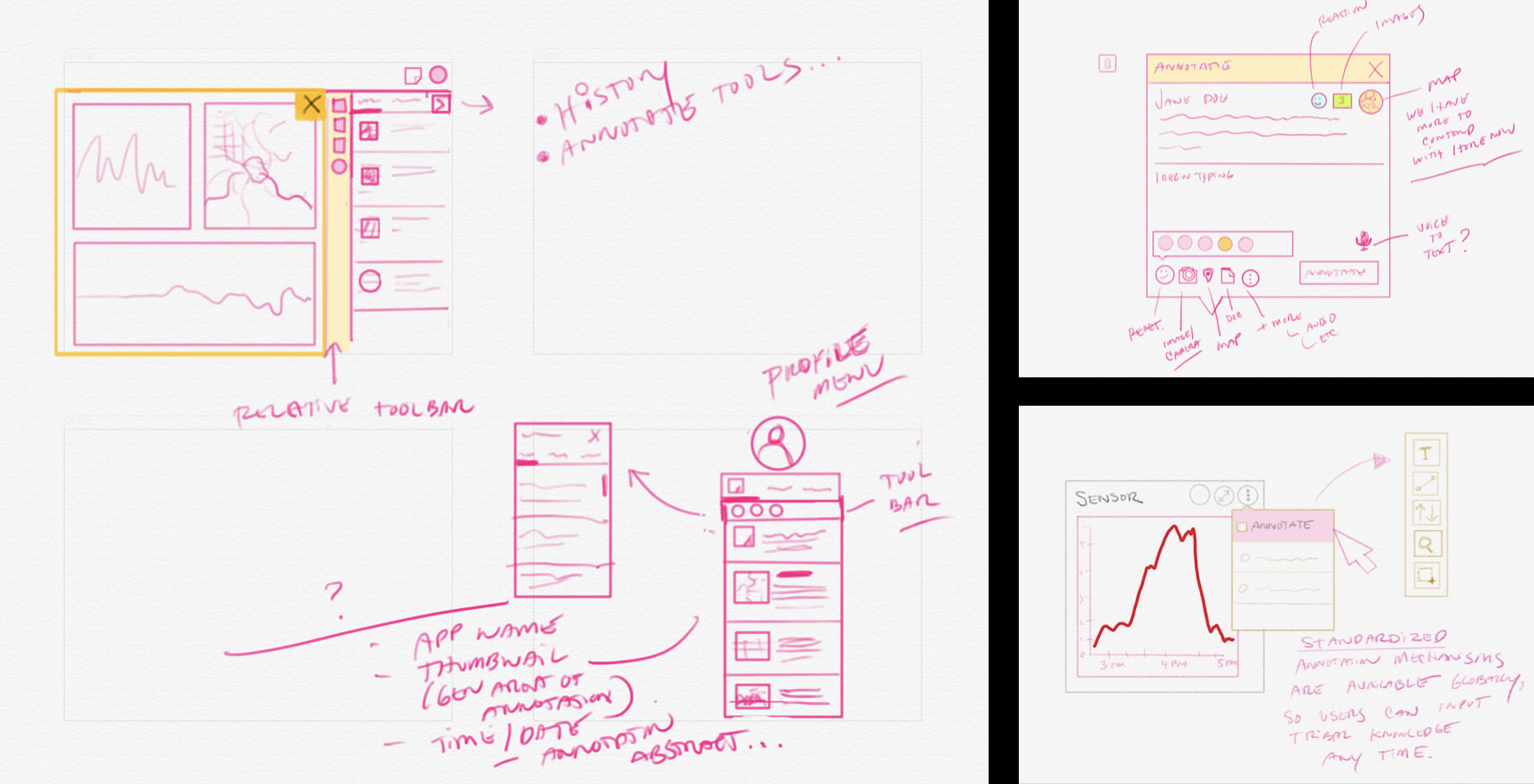
Inspiration was drawn from social media type mechanisms to create an intuitive familiarity
Annotations were intended to be applied to any element type in our solutions, so many potential use cases had to be considered. Basic text annotations seemed to be a natural starting point, and so we brainstormed on how a user might intuitively express meaning in various ways — exploring text input, entity tagging, correlations, context, data issues, sentiments, etc. Striving to let the user provide information in a simple and familiar way, I drew a lot of inspiration from social media type interactions.
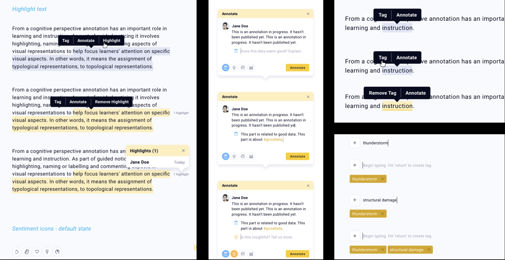
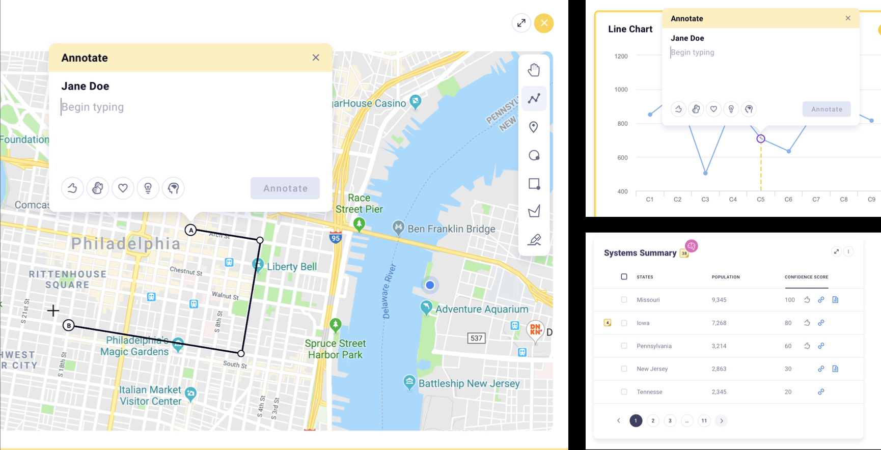
Annotation patterns were designed to be flexible, extendable, and scalable to various more complex interface element types
In addition to textual information, annotating other information types such as tabular, temporal, and spatial information needed to be considered, with an eye toward a future of annotating more dynamic information such as video and image sequences.
Reflections & Learnings
Instituting a design system smoothed out UI dev operations
By creating a library of high-quality patterns and guidelines, and a source of truth for our designers and UI developers, we were able to solve design problems in fewer cycles, and expedite efforts downstream by working more efficiently and consistently. The result being a more unified product experience for our end users.
© 2025 Designed and developed by Jeremy T Freeman