Transformative Workforce Management App
Empowering field reps by streamlining workflows, unlocking access to critical info, and replacing outdated systems for faster, smarter operations.
TL;DR
“We replaced a clunky truck-based laptop system with an AI-guided iPad experience that finally gave hundreds of field reps clarity in the flow of work.”
- The problem: Legacy tooling slowed reps, hid customer data, and couldn’t keep pace with modern scheduling needs.
- My role: Led research, UX strategy, and delivery—balancing team leadership with hands-on design and cross-functional alignment.
- The solution: Built predictive workflows, visual scheduling, and real-time info access inside a field-ready iPad app.
- The outcome: Rolled out across 14 states, boosting productivity and laying the groundwork for future productization.
Clarity starts here: framing the problem
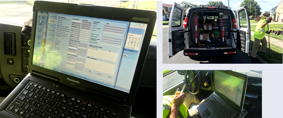
As a part of an enterprise app suite for a utilities client, an app for supporting the tasks of hundreds of reps doing work in the field needed to be created. The utility client's field service representatives (FSRs) were reliant on a legacy Windows-based system accessed through laptops in their trucks. This system presented multiple challenges:
- It had an archaic interface that was inefficient and clunky, requiring excessive time to input data, and leading to inaccuracies
- The system's siloed nature restricted FSRs' access to critical customer data, impeding informed decision-making
- The existing system did not support streamlined scheduling or efficient management of work orders
- The lack of a modern, intuitive interface hindered the ability of FSRs to effectively manage their daily tasks
These issues result in increased call times, data inaccuracies, and reduced operational efficiency. Furthermore, the legacy system lacked the capabilities to leverage data to improve processes, and there was no effective mechanism for capturing or using tribal knowledge from the field. The client required a transformative solution that would not only replace the outdated system but also empower FSRs with intelligent tools.
The business challenge: from clunky legacy to field-ready efficiency
An app for supporting the tasks of hundreds of reps doing work in the field needed to be created. This initiative sought to replace an aged legacy windows-based system with an innovative iPad app, delivering a user-friendly interface with end-to-end work order capability directly at their fingertips.
The new app aimed to:
- Update and modernize the app experience for FSRs in the field
- Build a tool to automate and streamline scheduling
- Provide more access to customer data to FSRs in the field
- Be able to better track metrics around field operations
The development of a new iPad app aimed to modernize workflows, implement smarter scheduling, and provide real-time access to essential data—enhancing data-capture accuracy, reducing call times, and achieving operational excellence, all within a few taps. Coming into the project, the client had already established a set of initial requirements and some rough design direction.
The audience: who we’re designing for, and why it matters
Our primary users were Field Service Representatives (FSRs): frontline utility workers responsible for executing complex, high-stakes tasks in unpredictable environments. Their job is critical: maintaining infrastructure, restoring service, and interacting directly with customers in the field.
These reps relied on laptop-based legacy software, often while parked in trucks between job sites. This setup made it difficult to input or access information efficiently, especially in time-sensitive or hazardous conditions. Every minute lost to clunky UI, system errors, or data gaps translated into delayed service, frustrated customers, and increased operational cost.
In parallel, FSR supervisors needed real-time visibility into field activities from scheduling and job progress to data accuracy and workforce productivity. The previous system offered little in the way of oversight, adaptability, or insight.
Field service representatives (FSRs) for utility companies executing work in the field, and FSR supervisors
We were designing for:
- Water, gas, and electric utility providers
- Teams with minimal tech tolerance and tight schedules
- A dual-audience system: individual reps with on-the-go needs, and supervisors managing teams at scale
Designing for these users meant not just building “a better app,” but deeply understanding their constraints, priorities, and the downstream impact of every tap and delay.
My role: shaping the experience, the team, and the collaboration
I led end-to-end product design for this initiative — from early vision through to rollout — balancing creative direction, hands-on execution, and team leadership.
Key responsibilities included:
- Creative direction across all UX and interface design efforts
- Sprint planning in collaboration with product and engineering
- Conducting ad-hoc research to validate ideas under real-world constraints
- Leading UX and interaction design, including prototyping and design systems
- Managing stakeholder relationships across business, tech, and field ops
- Hiring and onboarding designers, while actively managing team resources
Throughout, I acted as both a systems thinker and detail-level designer — ensuring we aligned business goals, field realities, and user experience into a scalable, shippable product.
My Approach: how I activate user-centered design with trust, insights, and agility
Build trust with the team
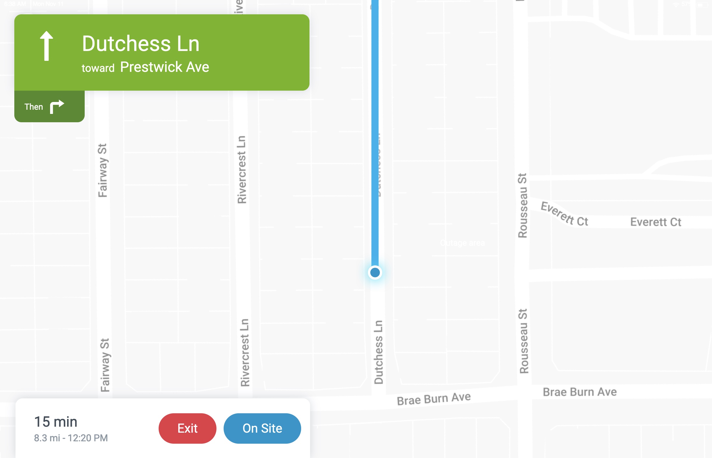
A formal research study for the project was not feasible due to time and resource constraints. However, I took a proactive approach by conducting ad-hoc research directly with the field service representatives (FSRs). Through ride-alongs, impromptu interviews, and informal feedback sessions, I gained valuable insights into their daily workflows, challenges, and preferences. As well, we had access to a committee of FSRs who would work with us and serve as beta testers to tap as a continuous resource for insights throughout the design process. As they would eventually be the ones using the app, their participation and faith in us was crucial. These interactions provided a hands-on understanding of the reps’ needs and allowed me to tailor the design more effectively to their real-world tasks. This direct, iterative engagement ensured that the solution was grounded in the actual experiences of those who would use it most.
Gather insights, wherever the opportunity arose
A formal research study for the project was not feasible due to time and resource constraints. However, I took a proactive approach by conducting ad-hoc research directly with the field service representatives (FSRs). Through ride-alongs, impromptu interviews, and informal feedback sessions, I gained valuable insights into their daily workflows, challenges, and preferences. These interactions provided a hands-on understanding of the reps’ needs and allowed me to tailor the design more effectively to their real-world tasks. This direct, iterative engagement ensured that the solution was grounded in the actual experiences of those who would use it most.
Streamline field work with smart, intentional visual design
In considering the design for the app, my approach was driven by four core principles aimed at optimizing usability, leveraging AI, and presenting information in a way that reps could immediately understand and act upon.
First, I focused on making the UI do as much work for the rep as possible. With the integration of AI, I sought to reduce some of the burden placed on the user by automating routine tasks and intelligently surfacing key information and choices. AI-powered suggestions and predictive functionalities were woven into the interface, offering reps actions and data tailored to their specific work orders, all while maintaining their control over final decisions. This allowed the system to act as a true assistant, minimizing repetitive actions and streamlining workflows.
Secondly, I prioritized the visual representation of key real-world objects. Field reps deal with complex, tangible assets like meters, premises, and other equipment in their daily work. By employing a visual language that directly reflected these real-world elements, it was ensured that the reps could immediately recognize and understand the tasks at hand. This included visualizing objects such as the meter, immediately recognizable icon imagery, and the visualization of a premise that a rep could understand. By bridging the gap between the digital interface and physical environment, the resulting UI was intuitive and familiar.
Thirdly, I aimed to create an interface that was as approachable as a consumer app without being overly embellished. This meant using design to express powerful functionality in elegant and simple ways, making the app easy to navigate and visually engaging without adding unnecessary complexity. Drawing inspiration from popular consumer applications — particularly social media-esque UI mechanisms, I focused on delivering a familiar and welcoming experience to a user population who may be more familiar with consumer apps than traditional enterprise software.
Lastly, the visual expression of data played a crucial role in my design approach. Given the vast amount of data becoming available to FSRs—from meter readings to customer history—it was important to present this information in a digestible, meaningful way allowing reps to grasp insights at a glance, make informed decisions quickly, and act on data-driven insights in the field.
Agile UX methodology for speed
To make this all happen, we adopted an agile UX process, ensuring that design and development remained tightly aligned. Working in short iteration cycles allowed us to rapidly prototype and test ideas, incorporating feedback from both product stakeholders and end-users at every stage. This iterative approach provided flexibility to accommodate new requirements as they emerged, ensuring the app remained responsive to evolving business and user needs. We focused on crafting interfaces that aligned with our guiding principles, refining layouts, workflows, and visual elements in each sprint to enhance usability and functionality. Frequent collaboration with cross-functional teams ensured a seamless integration of the evolving design with the technical build.
Rapid alignment on requirements
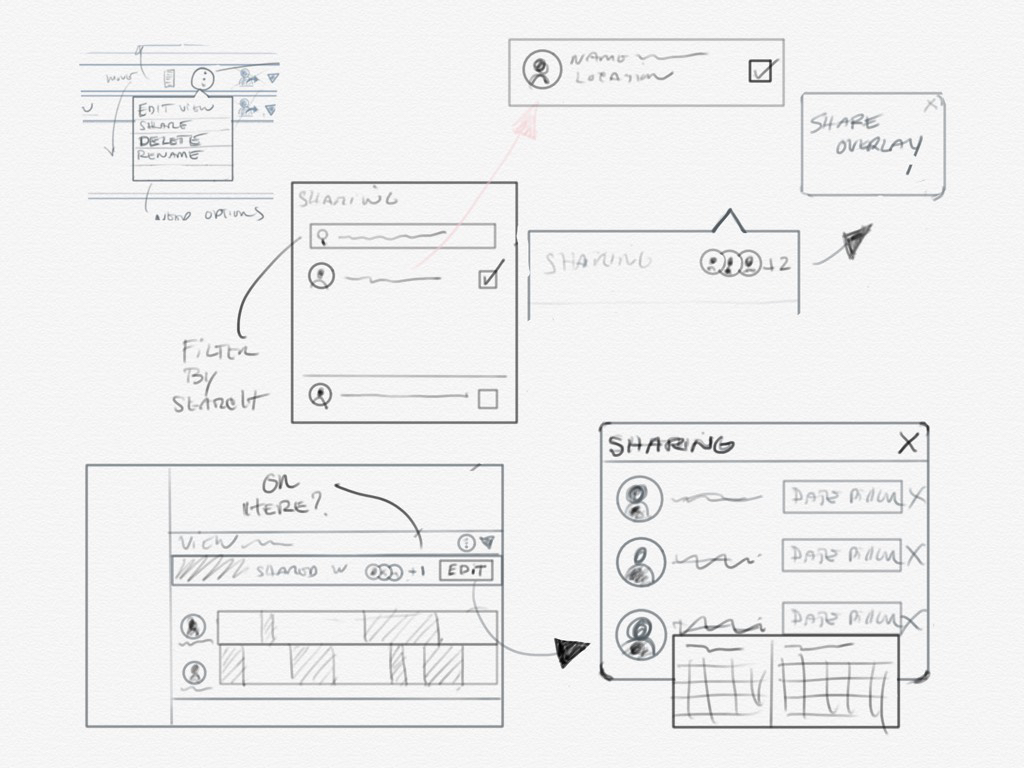
To quickly align on goals and priorities for each sprint, we collaborated closely with product teams in dynamic and efficient sessions. By hosting focused requirements workshops, we were able to uncover key needs and establish a shared understanding early in the process. Whiteboarding and creating rough sketches in a relaxed, informal atmosphere encouraged open communication and creativity, allowing ideas to flow freely. These lightweight, iterative sessions ensured we could explore solutions without being bogged down by unnecessary detail. Frequent and early reviews kept everyone aligned and allowed us to validate our direction continuously, reducing the risk of misalignment down the line.
Solution: a seamless experience, from schedule to service
The home screen was tailored to the needs of the rep
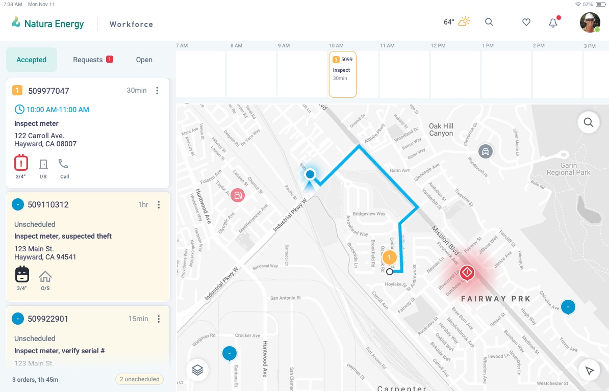
Information on the home screen was carefully structured to prioritize the rep's need for a quick view of key information that was particularly important to them. Seeing the nature of the work in the card view, work priority, visualizing the overall route for the day spatially, scheduling functionality, accepting work orders, and accessing work order information were key, and these items were given visual priority and were designed to be highly accessible from this starting point. Other secondary and tertiary functions were tucked a tap or two away. The form factor and touch capabilities of the iPad were leveraged here, allowing the user to move their schedule around by dragging and dropping, as well as scrolling their timeline and easily zooming in and out of the map.
The design leveraged visual analogs to signify key real-life objects
Wherever possible we implemented the strategy of using visual analogs to represent key real world items in the app. Visuals were created for tasks involving meters, premises, etc., enabling a visual connection and affordance to help make the app more intuitive. To make deeper use of this strategy, we developed ways of visually applying status indicators and actions using color and pictographic symbols where applicable. This visual approach reduced reliance on text, allowing FSRs to work faster and with greater accuracy.
As the complexity use cases/edge cases increased, it was important that we make the experience as simple and intuitive as possible for the end user — leaning more on visual recognition and familiarity as opposed to simply text.
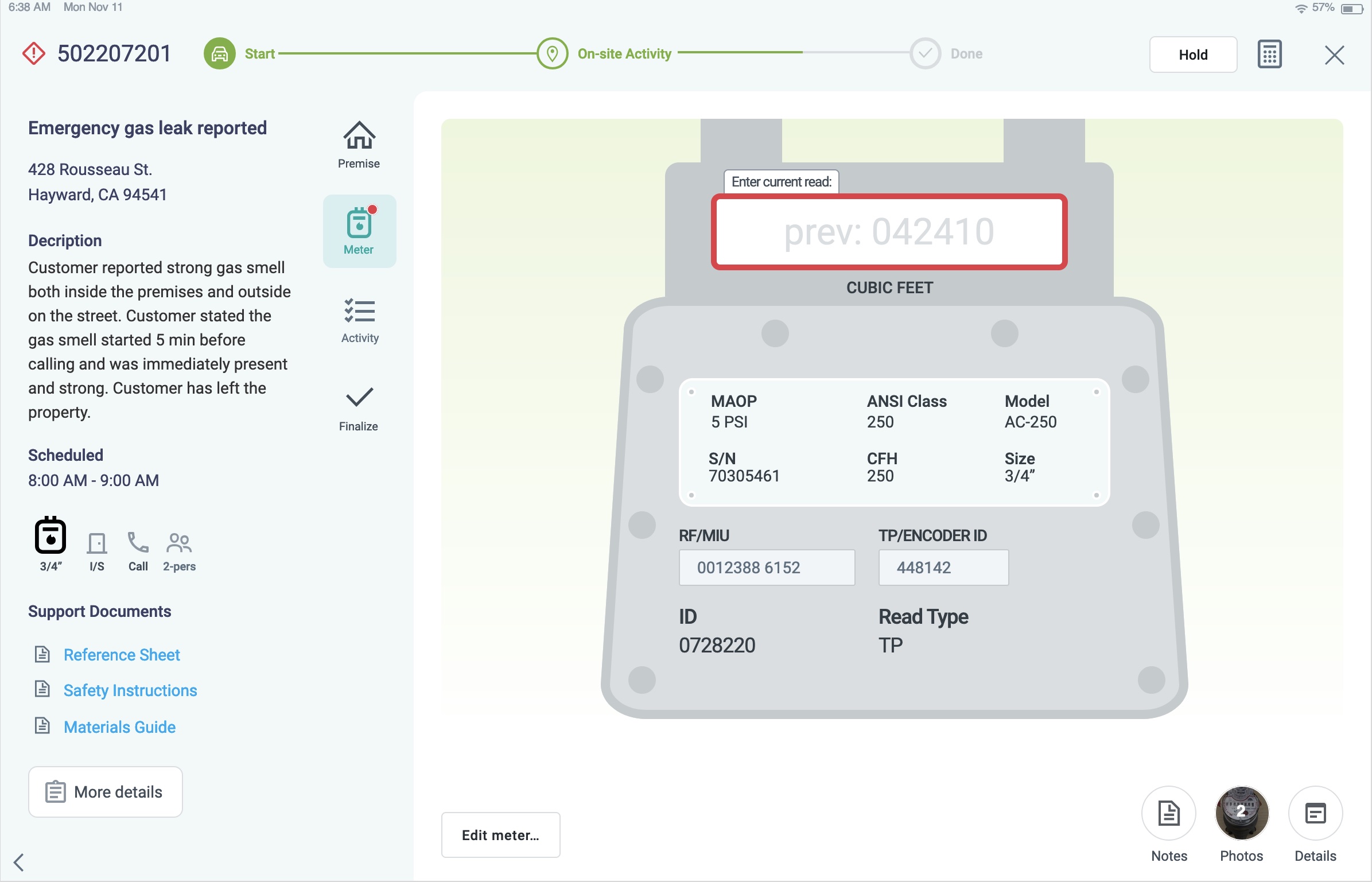
Work order cards were critical for rep decision making
The design of the work order cards played a pivotal role in enabling FSRs to efficiently manage their day, particularly when building their schedule. While AI assisted by partially assigning work orders, FSRs retained ultimate control over their schedule and needed at-a-glance insights to make informed decisions quickly and effectively.
FSRs needed a concise yet comprehensive overview of each work order to determine which to prioritize. The cards were designed to convey essential information at a glance, including:
- Job priority: Priority levels were prominently displayed to help FSRs determine which jobs required immediate attention.
- Nature of the job: Clear icons and brief descriptions allowed FSRs to immediately understand the type of job, whether it was routine maintenance, repair, or an urgent service.
- Meter size and status: Visual indicators conveyed the size of the meter and its operational status, ensuring FSRs could prepare accordingly.
- Special requirements: Jobs that required additional resources, such as a two-man team, were highlighted with specific icons and symbols to ensure proper preparation.
- Premise services: Information on the services provided at the premise, such as electricity, gas, or water, was easily accessible on the card.
- Special alerts: Notifications such as hazards or unique circumstances were made highly visible, reducing the chance of overlooking critical details.
- Time window requirements: The cards included the required time window for each task, allowing for better scheduling and ensuring that FSRs met customer expectations.
- Location and travel time: To optimize route planning, travel time and distance were included on the card, helping FSRs make efficient scheduling decisions.
Designing cards that contained all this information in a single, readable format was challenging. Early iterations struggled with overcrowded layouts, reducing readability and visual appeal. Additionally, piecemeal requests from the field team for new features complicated the design process.
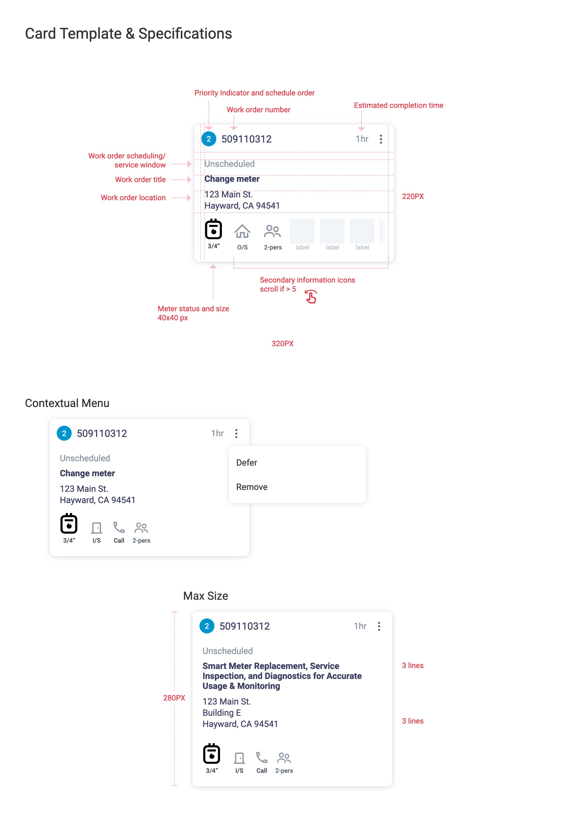
Recognizing the need for a holistic solution, we dedicated a sprint cycle to rethinking the card design from the ground up. This process focused on prioritizing clarity, and improving the overall visual hierarchy, resulting in a cleaner, more organized layout. Textures and shapes were introduced to support accessibility for color-blind users, ensuring that all FSRs could easily interpret the information.
Addressing accessibility: designing for color blindness
Given the high prevalence of color blindness among the FSR workforce, the design of the cards had to be inclusive and accessible. Instead of relying solely on color-coded information, we introduced:
- Textures and shapes: Different textures and geometric shapes were used to represent various job statuses, priority levels, and alerts. This allowed all users, regardless of color vision, to differentiate between important information.
- Clear iconography: The use of bold, easily distinguishable icons helped convey critical details without ambiguity.
The final design not only provided FSRs with the information they needed at a glance but also dramatically improved the efficiency and accuracy of their scheduling decisions. The designs were analyzed with color-blindness simulators throughout the design process, helping to guide our decisions along the way. Testing with the field team confirmed that the new card design met their needs in the field, helping to reduce their time spent on task management, and was accessible by all the users.
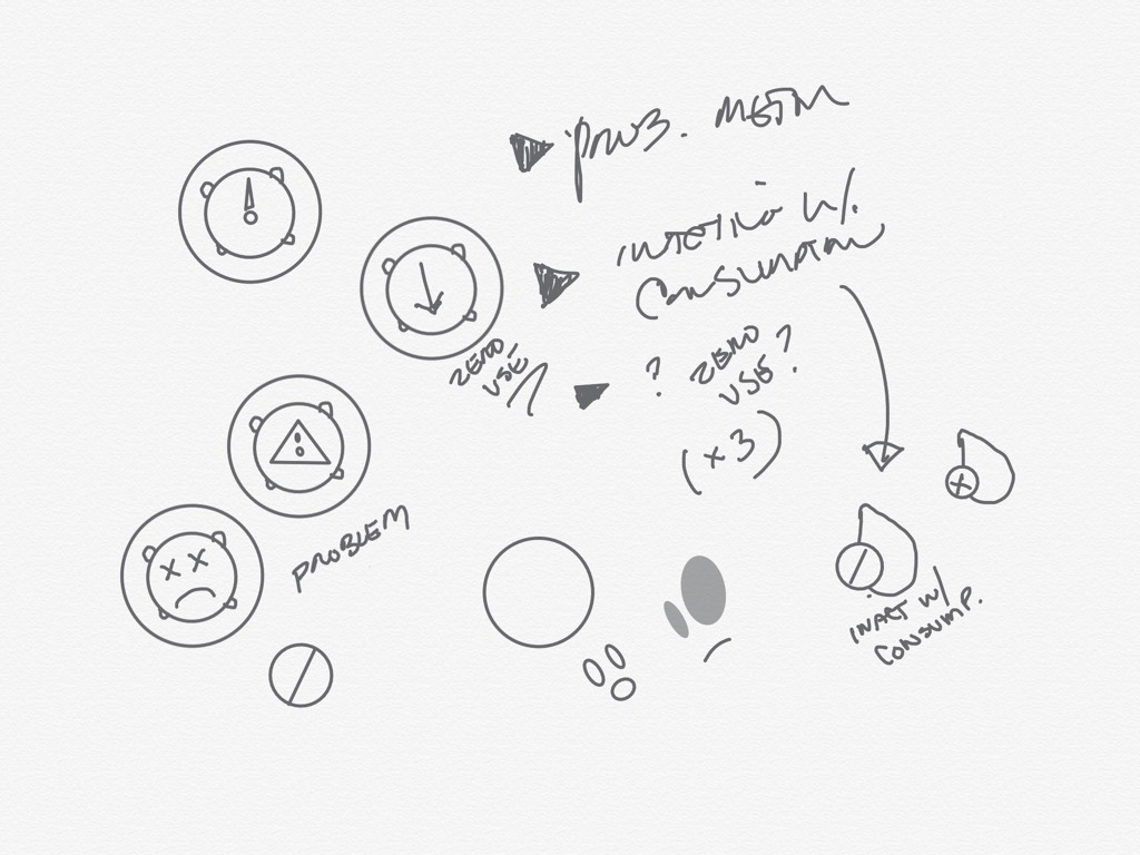
A guided process for executing work orders
The app provided an end-to-end experience for the rep — better managing their schedule with the power of AI, starting a work order, turn by turn directions to the job site, logging activity, and completing a work order. Once starting a work order, a step by step process was initiated, guiding the rep through completion of the work order. Many edge cases had to be considered for different customer and situational scenarios. AI on the back end was driving the identification of needs for preventative maintenance and customer and revenue issues, resulting in the creation of work orders assigned through this app. The overall design strategy was to present AI-powered suggestions and recommendations while allowing for ultimate user control.
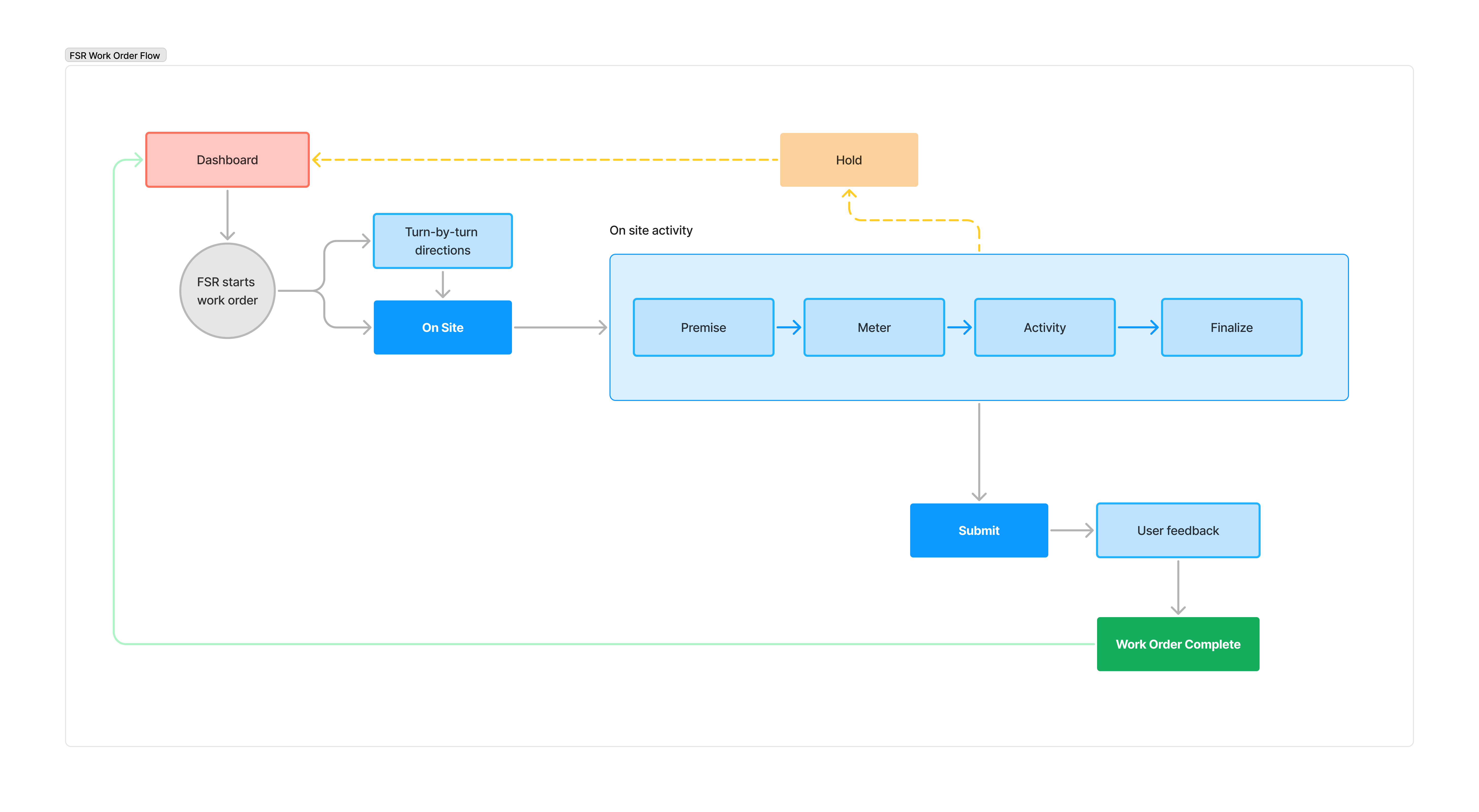
The app’s work order process was designed to streamline complex tasks while empowering field service representatives (FSRs) with intuitive, guided workflows. The premise view was a key element of this, offering an interactive map that displayed the location of meters and other essential assets at the location. This view not only made it easier for FSRs to navigate but also enabled them to actively contribute to data accuracy by uploading images or updating premise information in real time, reducing reliance on outdated data.
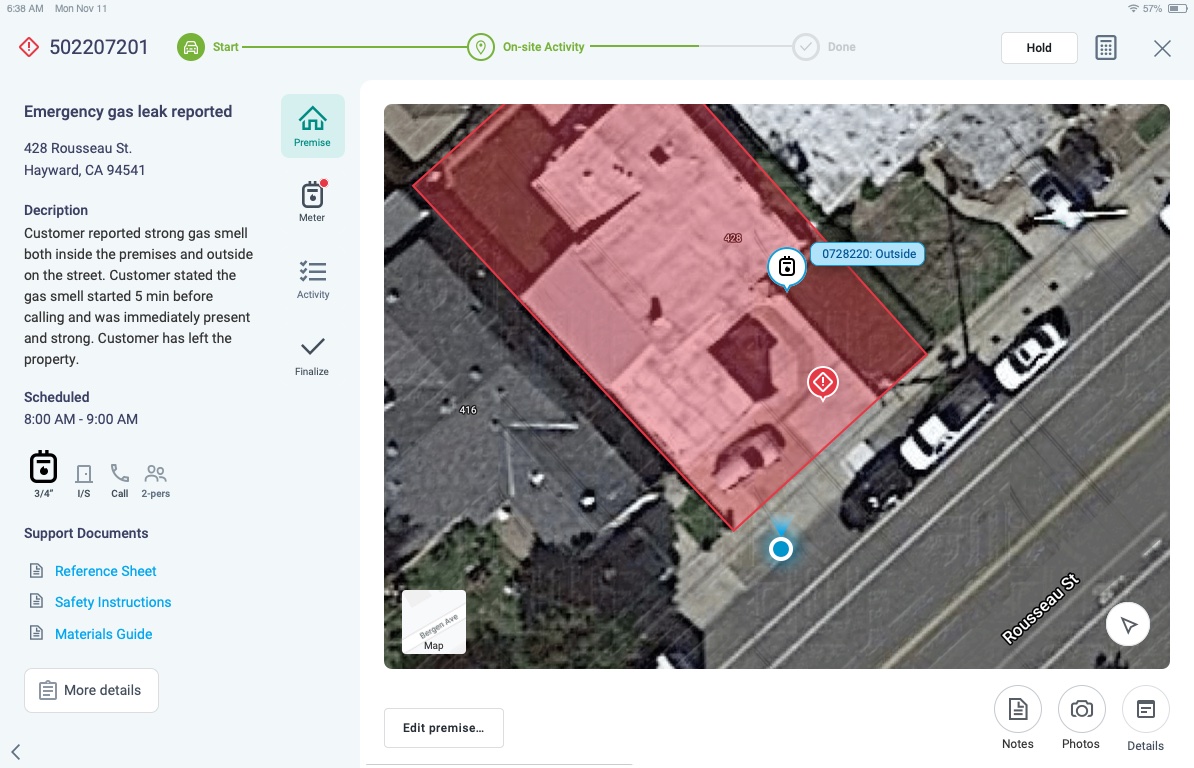
In the meter view, we designed a visual analog that represented meters in a highly familiar way, giving the reps meter information and allowing FSRs to quickly capture data or perform meter-related tasks. This included seamless support for scenarios involving multiple or dual meters, and a process for adding or replacing meters. This design helped reps focus on the job at hand without getting bogged down by having to parse through monotonous prosaic interfaces.
The field activity section allowed reps to capture every action they performed at the job site, creating a dynamic log and timeline that tracked progress across the work order. With the integration of AI, the app could intelligently suggest actions based on the work order and specific location, speeding up repetitive data entry while ensuring the rep maintained full control. This smart assistance balanced efficiency with flexibility, enabling reps to override suggestions and make judgment calls as needed.
Once the order was complete, the Finalize view allowed FSRs to input final notes, flag work orders for back-office review, or even generate follow-up tasks. AI was used to mine these final notes for tribal knowledge collection, building a continuous loop of learning that could enhance future processes and train the learning models.
Lastly, after the work order was submitted, a feedback mechanism was provided for reps, where they could rate the work order, provide insights on the quality of information, and review key performance metrics like time efficiency and task accuracy. This feature encouraged transparency and continuous improvement, creating an invaluable feedback cycle between the field, the organization, and the system.
The design of the app connected users to more information than ever
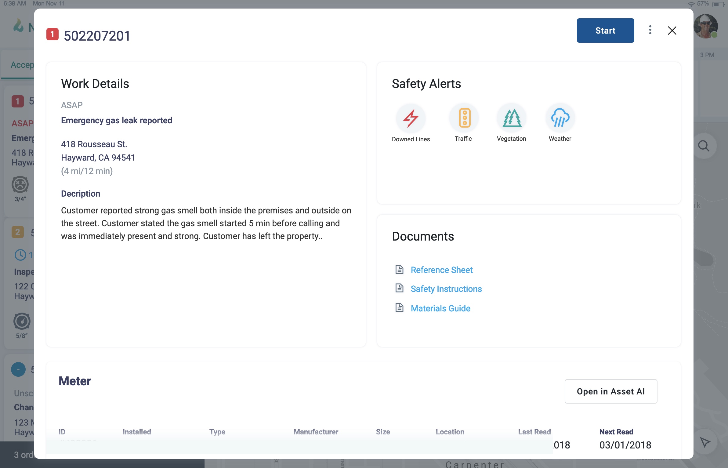
An innovative aspect to the overall business transformation happening was an unprecedented connection of data throughout the organization. Within this app, the rep had access to data about the customer, assets, usage, premise history, and a variety of other relevant data from other apps and sources at their fingertips. These integrations provided access to information and capability the reps did not have prior. These data integrations necessitated a number of data visualization screens to be thought through and designed.
Empowering reps with data access
By connecting various systems and centralizing data, the app allowed FSRs to work more efficiently and make informed decisions on the spot. Whether retrieving customer history, viewing service details, or accessing asset information, the app presented all this data at their fingertips, significantly enhancing their ability to resolve issues independently.
Key data types made accessible to reps included:
- Customer data: Access to current and historical service information, previous work orders, and service requests helped FSRs better understand the context of each job.
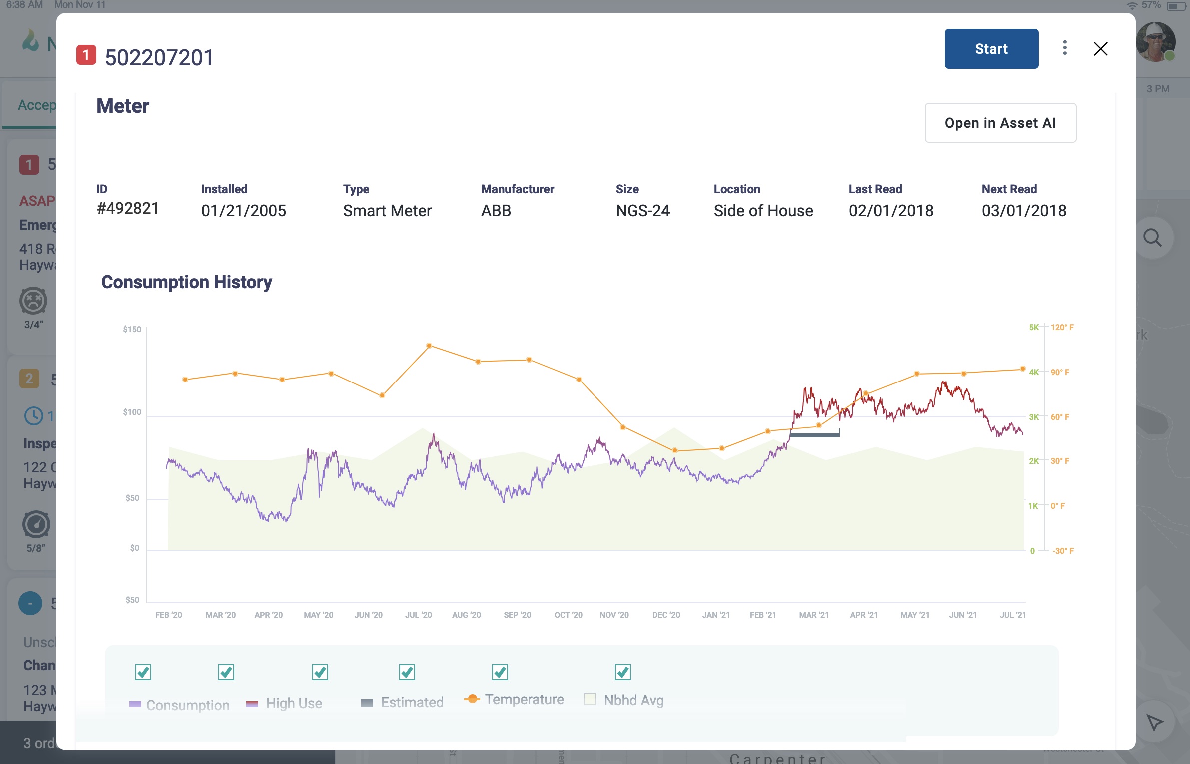
- Asset information: Reps could quickly retrieve meter specifications, location, status, and maintenance history, enabling more accurate assessments in the field.
- Premise details: Information about the services provided at each location—such as electricity, gas, or water—was readily available to ensure reps had a complete overview of the job.
Premise history timeline for deeper insights
To further empower FSRs, a premise history timeline was introduced, offering a chronological view of all activities related to a particular premise. This timeline displayed past work orders, maintenance tasks, service disruptions, and customer interactions in a visually digestible format. It provided a comprehensive picture of the premise’s history, helping FSRs understand recurring issues, previous fixes, and any long-term concerns with a given property.
This timeline became an invaluable tool for troubleshooting, as reps could quickly identify patterns or past problems that might inform their current task. Whether they were addressing a persistent issue or confirming that past repairs were completed successfully, the timeline ensured that FSRs were fully equipped with historical context.
Data visualization for easy interpretation
With the large volume of data available, ensuring it was presented in a clear and digestible format was crucial. Instead of overwhelming users with raw data, the app employed thoughtful data visualization techniques to present complex information intuitively.
- Visual hierarchies were established to prioritize key information, allowing reps to see the most critical data at a glance, such as job priority, meter status, and past service issues.
- Icons and color coding visually represented the status of tasks, alerts, and key metrics. Recognizing that many FSRs were colorblind, we expanded the design to include patterns and textures alongside color coding to convey important statuses without relying solely on color.
- Graphs and charts displayed usage history, work order timelines, and performance metrics, enabling reps to quickly spot trends or outliers in the data.
- Interactive elements allowed FSRs to drill down into more detailed data when necessary, without cluttering the main interface.
Connecting data for seamless decision-making
By designing for both high-level overviews and deeper data exploration, the app allowed FSRs to navigate effortlessly between summary views and detailed insights. This flexibility was essential when dealing with urgent tasks or complex maintenance requests that required fast decision-making. The premise history timeline, combined with real-time data access and intuitive visualizations, empowered FSRs to be more self-sufficient, reducing dependency on office staff and allowing for more accuracy in the field.
Future work and enhancements
Looking ahead, the app's capabilities can be further expanded through deeper AI integration and enhanced user interaction. A key opportunity lies in implementing natural language query capabilities paired with a generated analytics dashboard. This would allow field service reps (FSRs) to easily ask questions about their tasks or performance and instantly receive personalized, data-driven insights, empowering them to make more informed decisions with minimal effort. The integration of AI would also provide opportunities to streamline complex data analytics and allow users to interact more naturally with the system.
Additionally, introducing annotations for tribal knowledge will enable FSRs to document on-the-job learnings and best practices directly within the app. These annotations would help capture valuable institutional knowledge, facilitating better communication and knowledge sharing across teams. Expanding the use of the iPad’s camera for visual data capture would further enhance this process by allowing reps to upload images of completed work, site conditions, or equipment, enriching the data associated with each work order.
There is also significant potential in extending the app to other departments, tailoring the design to meet slightly different needs while maintaining a unified system. Incorporating personal analytics dashboards with elements of gamification could foster motivation by tracking individual performance metrics, providing incentives for completing tasks efficiently, and creating a more engaging user experience.
Reflections and learnings
Managing team dynamics throughout the project was critical
Over the course of three or so years, the project saw multiple iterations as deeper features were added and adjusted based on feedback from users in the field. Initially I was heavily hands-on, executing much of the design work myself, but as time went on, I hired and directed two other designers on the effort— often jumping in to work side by side with them in addition to managing other work. Throughout that time I remained the primary UX liaison and worked to ensure the strategy was delivered on, the work was of high quality, and that the team maintained the trust and confidence of our stakeholders.
There were missed opportunities
While the project delivered significant value, several areas presented opportunities for improvement. One notable limitation was that time constraints did not allow for much in the way of documentation. This lack of documentation made it more difficult to onboard new team members and ensure consistency throughout the project’s lifecycle. Having a more structured approach to documentation would have provided better clarity for the team and allowed smoother transitions as new members joined.
Conducting more extensive user research earlier in the project could have provided deeper insights into the specific workflows and pain points of the FSRs, potentially resulting in more tailored design decisions from the outset. Although ad-hoc user research was conducted, a more formalized and iterative approach might have uncovered additional opportunities to optimize the app for real-world conditions.
At minimum, sketch personas or other artifacts may have proved useful to guide design decisions and onboard new team members more effectively. While user research was conducted, personas would have provided a clearer picture of the target users, helping align the team around user-centered goals and ensuring that design decisions remained focused on the needs of the reps.
Additionally, more oversight over the final output from developers would have been beneficial. As the project progressed and timelines grew tight, ensuring closer alignment between the design and development teams could have mitigated issues such as minor inconsistencies in implementation. This would have helped maintain the original design vision and improved the quality of the final product.
A transformational implementation, intended to be productized
The advent of this app introduced a number of transformational capabilities to our utility client. The abili ty to schedule and predict working times allowed the organization to more accurately manage and conduct field operations with improved performance. With the collection and available access to data from across the organization, field reps were able to perform their jobs with more precision. Connections between data and mechanisms for collecting data positioned the organization to constantly improve and train their systems to be smarter.
With the intention of this being a productized offering, this app became a proven template for a workforce management solution targeting water and energy sectors, among others.
© 2025 Designed and developed by Jeremy T Freeman